Getting started with Themes
Quick 'n Easy Web Builder has supported themes for a long time, however previously they were only useful for jQuery UI widgets.
The Theme Manager has recently been updated to support almost all objects. Unlike jQuery UI widgets which requires a pretty large CSS set. The new themes only have a small foot print.
The Theme Manager has recently been updated to support almost all objects. Unlike jQuery UI widgets which requires a pretty large CSS set. The new themes only have a small foot print.
How are themes different than styles?
A 'theme' is basically just a simplified version of a style, with only a small subset of properties (text color, background color/gradient/images and borders). It provides a quick way to entire style of the page. Unlike styles, you can only use one theme per page. A theme affects multiple items of an object. For example, the header, content, button etc. Unlike styles where you would need a different style for each item. Themes are global. This means that if you edit a theme then it will affect all projects!
See also: Style Manager
See also: Style Manager
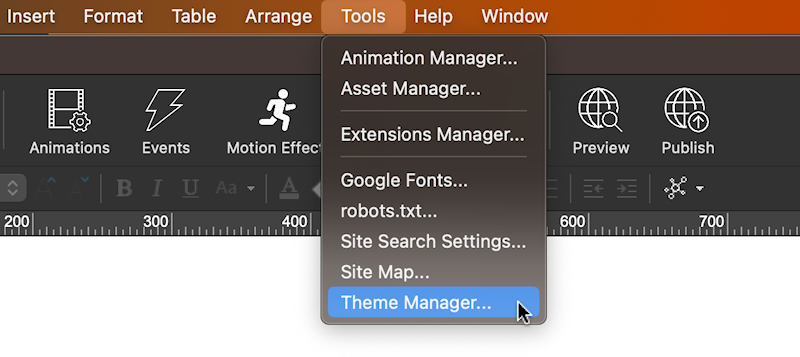
Theme Manager
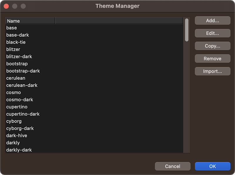
The Theme Manager offers options for managing themes. You can add, edit, or remove themes with ease.
To create a new theme, simply click the 'Add' button. For tweaking an existing theme, hit 'Edit' to make desired adjustments. Alternatively, 'Clone' allows you to replicate the selected theme as a foundation for a new one. Use the 'Remove' button to remove a theme from your collection.
There is also an option to import CSS themes generated by the jQuery UI theme roller website (https://jqueryui.com/themeroller/).
This this will only import the color scheme, because there is no way to extract style data from images.

In the 'Edit Theme' window you can customize the style for different states: Header, Content, Button (default state, hover, active).
The content area may be the panel of a set of tabs or an accordion. The page background and text will use 'content'. While buttons use 'button' and the heading object use the colors of the 'header' section. The radius specifies the roundness of the borders.
On the right side of the window, a live preview of your theme is displayed, offering you a glimpse of how your changes will manifest.
Tip: Click on any of the preview elements, and you'll instantly navigate to the corresponding style section in the property grid.
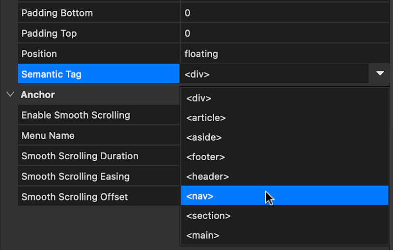
By default, layers and layout grids inherit their colors from the 'content' category, but you can customize this behavior through the 'semantic tag' property. For instance, headers and footers can be configured to adopt 'header' colors, while navigation elements ('nav') use the color scheme of buttons. This level of control lets you achieve the precise visual harmony you desire for your project.
The content area may be the panel of a set of tabs or an accordion. The page background and text will use 'content'. While buttons use 'button' and the heading object use the colors of the 'header' section. The radius specifies the roundness of the borders.
On the right side of the window, a live preview of your theme is displayed, offering you a glimpse of how your changes will manifest.
Tip: Click on any of the preview elements, and you'll instantly navigate to the corresponding style section in the property grid.
By default, layers and layout grids inherit their colors from the 'content' category, but you can customize this behavior through the 'semantic tag' property. For instance, headers and footers can be configured to adopt 'header' colors, while navigation elements ('nav') use the color scheme of buttons. This level of control lets you achieve the precise visual harmony you desire for your project.
When you are done designing your theme click 'Save'. The Theme Manager will now generate the CSS files and associated images.
If the theme already exist you will be asked to overwrite the current theme.
If the theme already exist you will be asked to overwrite the current theme.
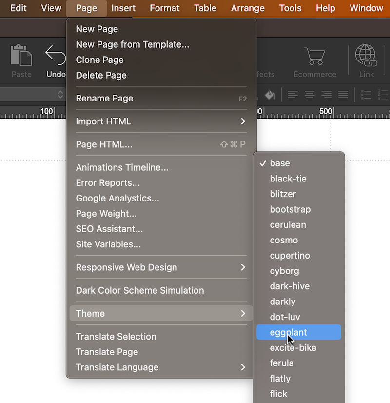
Choose a theme for the page
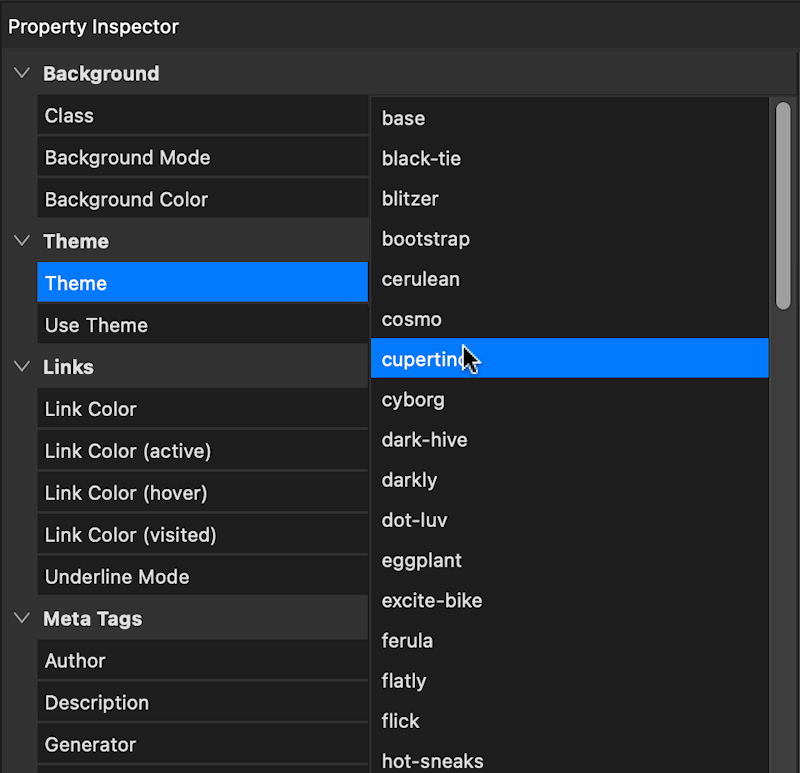
The "Theme" property (Page Properties -> Theme) specifies the theme for the page, it applies to all theme enabled objects on the page.
There is also a theme selection option in the Page menu:
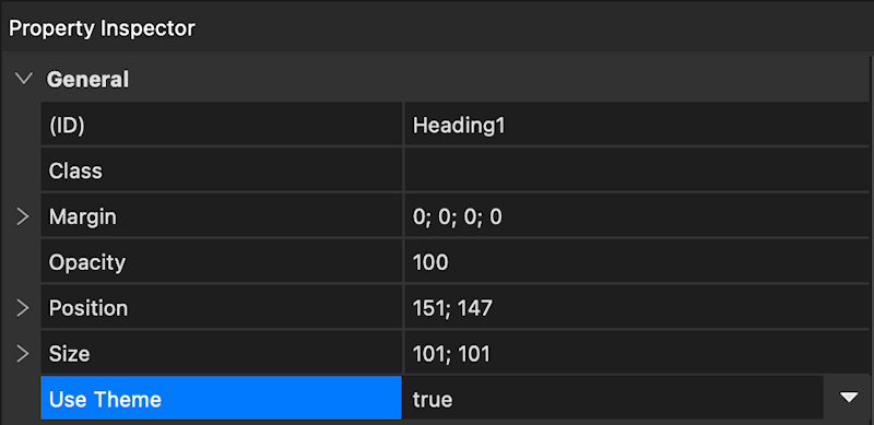
Enable theme support for objects
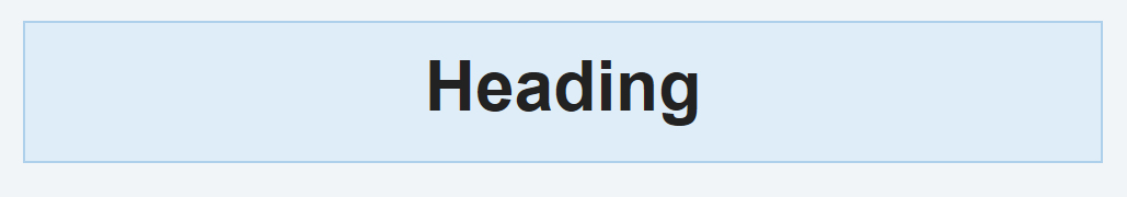
You can activate theme support for individual objects by using the 'Use Theme' property.
When this option is turned on, it will supersede the local object color settings.
When this option is turned on, it will supersede the local object color settings.
Dark Color Scheme
The Theme Manager also supports dark color scheme so you can define a different color scheme for use who prefer darker colors.
To create a dark variation of a theme, just clone the existing theme and append "-dark" to its name. For instance, if you have a theme named 'bootstrap,' its dark counterpart would be 'bootstrap-dark.'
To create a dark variation of a theme, just clone the existing theme and append "-dark" to its name. For instance, if you have a theme named 'bootstrap,' its dark counterpart would be 'bootstrap-dark.'
Note:
The dark theme will be visible within the Theme Manager interface; however, it won't appear in the main Theme selection options on the page. This is because it functions as a complementary theme rather than a standalone choice.
Instead, the dark theme will be automatically activated when the 'dark color scheme simulation' feature is enabled on the page.
Remove border and background from themed objects
When working with themes, you may occasionally prefer to omit borders and backgrounds on certain objects to achieve a cleaner design. This is especially relevant for elements like headings, hamburger menu buttons, layers, or layout grids. To accommodate such situations, we've introduced a special workaround: setting the border style to 'none' will effectively eliminate both the border and background from these objects.
Normal behavior:
No border and background:

The functionality is currently implemented for the following objects:
• Heading
• Button
• Form
• Layer
• Layout Grid
• Flex Container
• Flex Grid
• Overlay Menu (hamburger menu)
• Panel Menu (hamburger menu)
• Icon
• Card Items
• Heading
• Button
• Form
• Layer
• Layout Grid
• Flex Container
• Flex Grid
• Overlay Menu (hamburger menu)
• Panel Menu (hamburger menu)
• Icon
• Card Items
Creating a themed logo
Another valuable feature for themed pages is the capability to have a logo that seamlessly adjusts to match the theme's colors.
1. Begin by creating a transparent image where the logo employs only black as its color.
2. Use the standard image object to insert the logo onto the page.
3. Configure the image's border style to 'none.'
4. Enable the 'Use Theme' option.
By following these steps, the logo will adopt the theme's icon color.
Logo without theme colors:
Logo with theme colors:
How to remove theming from all objects simultaneously?
In the right-click context menu for objects, you will find an option 'Use Theme' that allows you to enable or disable theming for the selected objects. If you hold down the SHIFT key while selecting this option, it will disable theming not only for the chosen objects but for all objects on the page, including the page itself.
Demo
